When in Rome…
When in Rome…
For 11 of the 21 years I have been happily and gainfully employed at DiMella Shaffer, I have had the additional privilege of co-leading a long-standing summer study abroad program with a friend who works at the Boston Architectural College. Over the years, we have taken more than 120 students to Paris, Florence, Madrid, and Rome — with excursions to nearby cities, and even cities in England and Germany, to enhance their education.
“I want to see therefore I draw.”
— Carlo Scarpa
While it has been a unique challenge to fit into my project work schedule the elective task of preparing a month of pre-departure class work even before the month-long program can begin in situ, it has been equally rewarding to arrive at our selected destinations primed with a sense of expectation and purpose, with empty sketchbooks waiting to be filled. Indeed, I reveled in every opportunity to sketch alongside the students while engaging in conversations about history and design. It was during our most recent program, based in Rome, that the relatively quick watercolor sketch — neither a rendering nor a wash — became a compelling technique to document what I love about this eternal city.
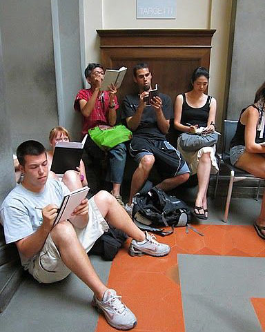
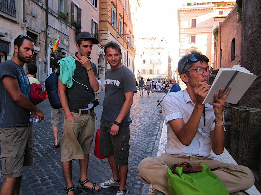
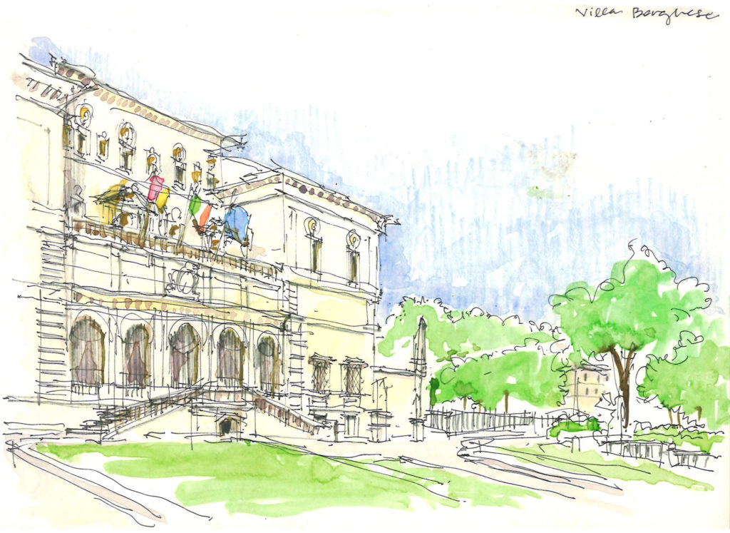
Treating the city as an open-air classroom that summer, spanning from ancient forums with imperial monuments to what felt like every cobblestoned piazza in between, I got to reflect on how manifest ruin and decay become layered into one’s appreciation of Rome as eternal. Gazing upon a once triumphant arch or vault, long enough at least to sketch it, the students and I engaged in the way these symbols of empire garner significance today: suspended in a state of ruin, devoid of their intended architectural program, signifiers of a once and future civilization whose subsequent cultural contributions – be they in support or defiance of a vaunted past – ultimately are what can be considered everlasting. In this context of longevity through adaptation, the 12th century church of San Clemente, whose foundations incorporate the excavated layers of earlier republican era buildings, and Richard Meier’s 21st century museum for the Ara Pacis, an altar from the 1st century B.C., perform the same act of balancing tribute and invention. And whether it’s due to or despite Rome’s relative wealth in extant material from antiquity, it is the treatment of this material less as phenomenon and more as practical fact that shapes both the contemporary city and my fascination with its eternal, unselfconscious reanimation.
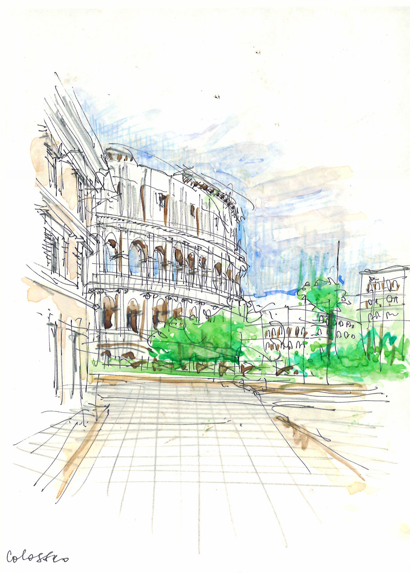
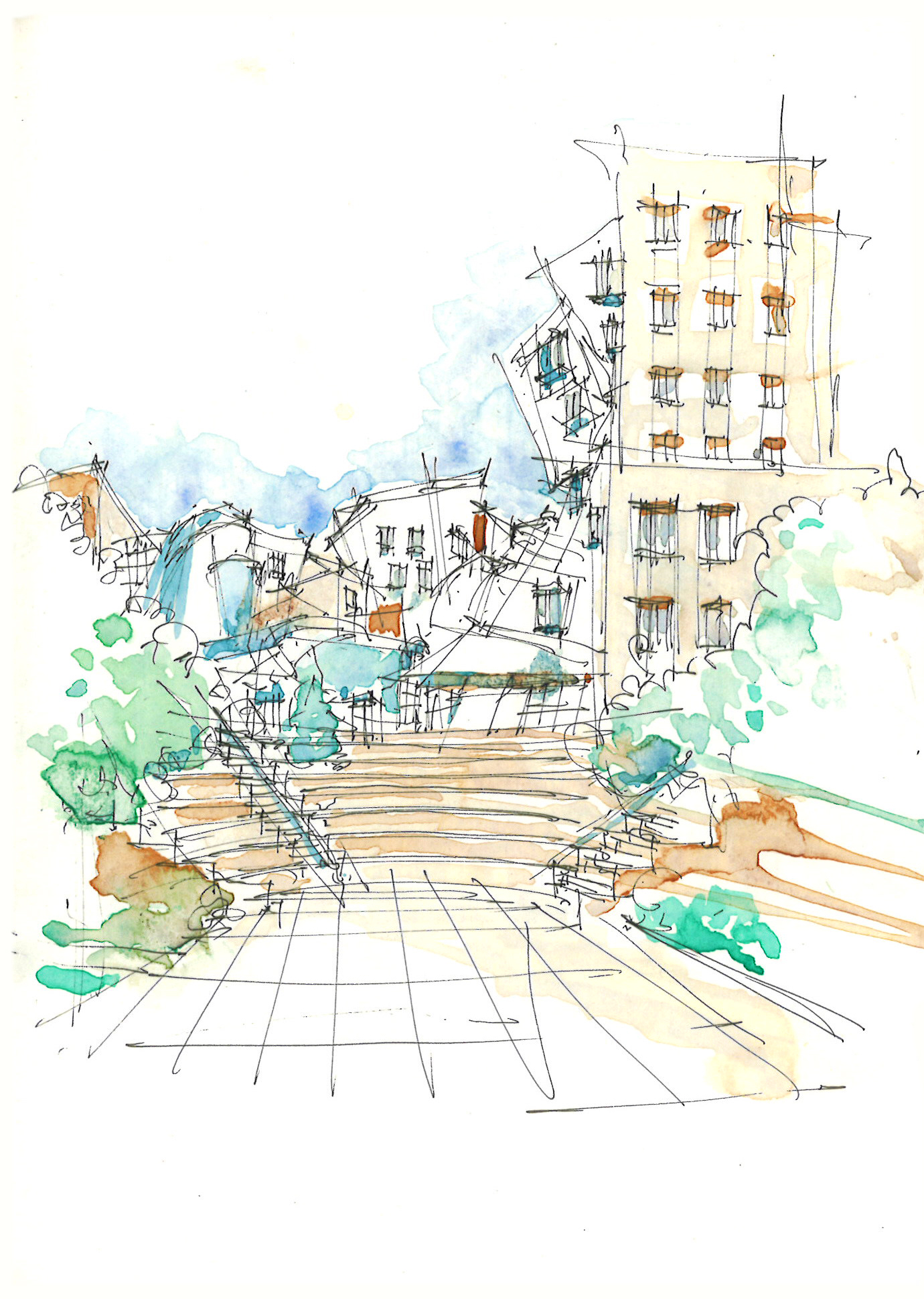
Watercolor was integral to having and making these observations about Rome. It could quickly convey a sense of surfaces burnished by time and suggest how buildings that weather predictably can also participate positively to pride of place. When compared with recent sketches from Boston, Cambridge, and New York — cities younger and arguably shinier than Rome — watercolor can be seen to capture such uniquely modern urban conditions as delirious verticality and anonymity formalized by the grid. As such, I am compelled to further explore the medium’s versatility to, at once, render and reveal and I look forward to seeing and understanding more of the world in watercolor.
BY GIOVE. . .
I have many talented colleagues at DiMella Shaffer who express themselves creatively beyond architecture — from the recently-featured photographer who folds horizons bilaterally to the painter who veils figures in celestial light — and each combines a willful sense of discovery with discipline in his/her extracurricular pursuits. In contrast, inasmuch as I have ever developed anything resembling a technique (it’s more muscle-memory, really), I might offer to dissect the following sketch of Castel Sant’Angelo (a musical colleague’s favorite) in order to provide some insight into how I see/draw the world.
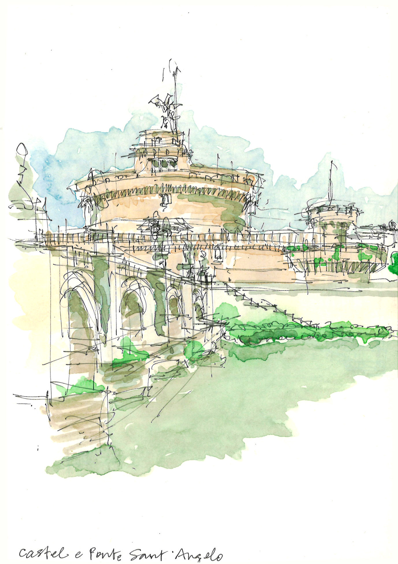
- The setting is an embankment staircase just across the Tiber from Castel Sant’Angelo. I wanted to make an expository composition of the vertical fortification, the horizontal wall and the perpendicular bridge. I had descended a couple of steps to force the horizon below the sidewalk; and I remember sharing the stoop with a more-transient denizen of Rome — which might explain the ultimate choice of colors.
- I use a 0.2mm black felt tip pen; it is small and disposable, and can sound like I’m etching on paper. Providing construction lines that establish the field of view and indicate where I intend to contrast colors is what I hope to lay out before painting.
- The sketchbook I use is light and rigid, as I prefer to keep it elevated while drawing; I do this because I do not want to lose track of the focal point by constantly having to look down at a book on my lap. Maintaining a constant body/head/hand/eye position also helps me with accuracy and comfort.
- I carry a 12-pigment, 3-well travel-size watercoloring set and store clean water in an old 35mm film canister (for those who remember what that is); since I always have paper towels (new and gently-used), they are perfect for absorbing/wiping away expended colors when new ones are desired.
- Last but not least, rendering some portion of the sky and ground plane (especially any areas that give further definition to the subject of the sketch) can also help impart a sense of the localized environment — and in this particular case, it can trigger memories that most likely will last longer than the ink and transferred pigment — which, in the end, is as it should be.
Since I always have paper towels!
Jovi your ears must have been burning, I was just telling a coworker who is planning a vacation about your annual trips to Rome.
The sketches and tips are great.
Cheers!
– Diana
Those are really some amazing pieces of art Jovi
Love your watercolors, are they for sale or print?
They are not at the moment but perhaps they should be! Thank you, Lisa.